

What are the Most Popular Farrow & Ball Paint Colours?
Here at Pat McDonnell Paints, our team of experts takes pride in helping customers find the perfect paint colours to bring their décor dreams to life. One of our most popular brands, Farrow & Ball, is renowned for its iconic colours, impeccable finishes, and timeless appeal. In this article, we’re diving into the shades our customers can’t get enough of—exploring what makes each one so popular, how they work within today’s top design trends, and why these colours continue to inspire beautiful spaces.
1. Skimming Stone No. 241
In 2024, Skimming Stone topped our customers' Farrow & Ball favourites list. This warm neutral sits perfectly between grey and taupe, making it exceptionally versatile. Its key appeal lies in its chameleon-like ability to shift with lighting conditions, appearing light and airy by day and warm and cosy in dimmer lighting.
Skimming Stone adapts effortlessly to various décor schemes. If you’re embracing the Japandi aesthetic, try pairing it with Strong White to create a calming, minimalist look. Alternatively, for a more dynamic contrast, set it against the deep purple tones of Pelt.
2. Elephant’s Breath No. 229
Pared back and cosy, the mid-grey colour of Elephant’s Breath offers a slightly darker alternative to Skimming Stone. This uplifting neutral suits a variety of interior schemes. Its subtle magenta undertones give it a beautiful depth of colour, appearing warmer in bright light and taking on a hint of lilac in cooler lighting.
Fans of the Cottagecore look may consider an earthy palette featuring Elephant’s Breath, Strong White, and London Clay. Enhance the romance and charm of this aesthetic by adding floral accents, soft textures, and vintage furniture.

3. Ammonite No. 274
Ammonite’s remarkable versatility is key to its popular appeal. This understated neutral strikes a balance between warm and cool tones, meaning that it will look well in rooms of all orientations. Ammonite is ideal for Scandi-inspired minimalist spaces. Its neutrality complements a palette of soft greys, whites, and natural elements like wool and timber.
With hints oh-so-subtle hints of grey, Ammonite offers an elegant partner for crisp whites such as Wevet. The subtlety of this colour means it is a great alternative to brilliant white on ceilings and woodwork especially when teamed with darker colours such as Mole’s Breath.
4. Hague Blue No. 30
The inky richness of Hague Blue will add a touch of moodiness and grandeur to any space. Hague Green presents a beautiful alternative to charcoal grey for those who want to take a more colourful approach to the dark trend. What’s more, its deep green undertones give it enough warmth to create a cosy vibe, while still offering a sense of drama.
For those embracing the Maximalist trend, Hague Blue’s deep, moody hue is perfect for “colour drenching,” a technique where walls, ceiling, and even woodwork are painted the same colour. Incorporate bold patterns, rich textiles, and eclectic artwork to complete the look.

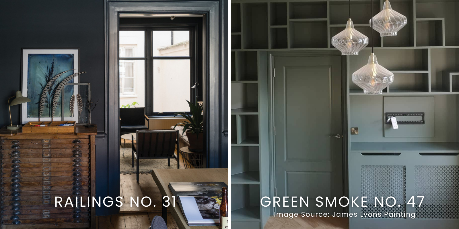
5. Railings No. 31
A deep, almost black navy, Railings offers a gentler alternative to pure black. Its softness can be further enhanced by pairing it with natural textures such as wooden floors, woven baskets, chunky knit throws, etc.
Classic yet chic, this colour is exceptionally adaptable and offers an elegant choice for traditional and modern spaces alike. Railings will inject old-world elegance and comfort into minimalistic Modern Classic interiors.
Use it on kitchen cabinets or island counters for a timeless look, or in north-facing rooms to embrace natural shadows for a dramatic, cocooning effect.
6. Green Smoke No. 47
Not only is Green Smoke one of the most popular Farrow & Ball colours here at Pat McDonnell Paints, but it Is also the most popular paint shade for walls on Instagram. This deep green with blue-grey undertones has a hint of smokiness that brings a calm and grounded energy to any space. Its versatility allows it to pair beautifully with a range of colours and finishes—from rich gold and black to plum and navy. As such, it is a popular choice for adding colour and character to small WCs or cosy reading nooks.
7. Cornforth White No. 228
Cornforth White is a subtle and soft warm grey. This colour can be played up or down depending on the lighting conditions and what other colours are used in the space. This chameleon quality lets it balance bold accents or subtly blend with similar tones.
Endlessly versatile, Cornforth White offers a stylish alternative for those who want to move away from stark white or cream. It serves as a relaxed, elegant backdrop that lets other colours shine, pairing well with rich blues, earthy greens, dusky pinks, and even burnt orange for a hint of warmth.
8. Beverly No. 310
Added to the Farrow & Ball collection in 2022, Beverly is the newest colour on the list but has quickly secured a position as a customer favourite! And no wonder as this lush forest green appeals to our ongoing love affair with green paint colours. One fascinating aspect of Beverly is its ability to transform depending on lighting; it appears more vibrant in bright daylight and adopts a more subdued tone in lower light.
Beverly beautifully taps into the Biophilic Design trend which emphasises our connection to nature. It pairs wonderfully with houseplants, natural textures, and beautiful woods, creating a harmonious environment that brings the outdoors in.

9. Shaded White No.201
Shaded White is an off-white with a gentle hint of grey that lends it an almond-like warmth. his versatile neutral strikes a balance between warm and cool, offering a relaxed alternative to bright white that’s perfect for creating soothing, laid-back spaces.
With its understated quality, Shaded White is ideal for those looking to embrace the Coastal style, which favours soft, nature-inspired neutrals. Give your home a relaxed, beachy vibe by pairing this colour with soft blues like De Nimes or muted greens such as Mizzle. Add the final touch with washed linen, stripy textiles, seagrass baskets and driftwood accessories.
10. Sulking Room Pink No. 295
Described by Farrow & Ball as “a grown-up blush,” Sulking Room Pink is an excellent choice for those seeking a more muted, sophisticated pink. The softness of this dusky rose ensures it won’t overpower your space.
Balance out Sulking Room Pink’s romantic qualities and give it a modern twist by pairing it with dark shades like Railings, Paean Black, or De Nimes. Alternatively, embrace the gentle vibrancy of this shade by combining it with soft neutrals like Wevet or Shaded White, and add a playful touch with a soft blue like Oval Room Blue. This colour scheme is particularly charming in children’s rooms and nurseries.

Ready to try out one of these stunning Farrow & Ball colours in your home? Visit any of our stores to explore the Farrow & Ball colour stand, pick up a colour card, or grab paint testers. If you’re looking for guidance tailored to your specific project, book a colour consultation with one of our qualified experts, who can help you choose the perfect palette to bring your vision to life.
Have a question? Why not call into your local branch of Pat McDonnell Paints and speak with one of our experts! Fast & free delivery on all orders.